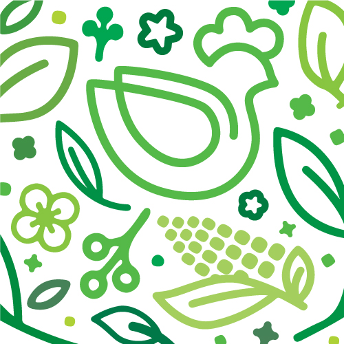
Best Color Palettes for Graphic Design
Every brand has their own story – whether it’s in West Paces Ferry or the West Indies.
Choosing the best color palettes for graphic design is one of the most important steps in creating a design that looks great and tells the right story.
Whether you’re adding a new piece to your graphic design portfolio or designing patterns for graphic design, the colors you pick can change how people feel about your work.
In this article, we’ll explore some of the best color palettes for graphic design, how to choose them, and how different colors can change the mood of your design.
What Are the Best Color Palettes for Graphic Design?
When it comes to picking the best color palettes for graphic design, there isn’t just one right answer.
The best palette depends on what you’re working on, who it’s for, and the message you want to share.
Still, some color combinations are popular because they always seem to work well.
Monochromatic Palettes:
These use different shades of the same color. They create a simple, clean look and are often used in modern designs.
Analogous Palettes:
Analogous palettes use colors that are next to each other on the color wheel. They create a calm, relaxed feeling, perfect for designs that want to be peaceful.
Complementary Palettes:
These use colors that are opposite each other on the color wheel. The strong contrast makes designs stand out and grab attention.
Triadic Palettes:
Triadic palettes use three colors that are evenly spaced on the color wheel. They are colorful and balanced, making designs lively but not overwhelming.
Tetradic Palettes:
These use two pairs of opposite colors. They create a rich and varied look, which is great for designs with a lot of detail.
How Do I Choose a Color Palette for Graphic Design?
Choosing the right color palette involves thinking about what you’re designing, who it’s for, and how you want people to feel when they see it.
1. Know the Brand:
Start by understanding what the brand or project is about.
The colors should match the brand’s personality.
For example, a tech company might like cool, modern colors, while a toy company might choose bright and fun colors.
2. Think About the Audience:
Different people like different colors.
Think about who will see your design.
For example, kids might like bright, bold colors, while adults might prefer softer, more elegant shades.
3. Consider Where It Will Be Used:
Where your design will be seen matters.
A color palette that looks great on a website might not work as well in a printed flyer.
Make sure your colors look good wherever they appear.
4. Use Helpful Tools:
There are online tools that help you play with different color combinations.
They make it easier to see how colors work together before you decide.
5. Test Your Palette:
After picking a color palette, try it out in different places.
This helps you see how the colors work together and if they look good in all situations.
How Do Different Color Palettes Affect the Mood of a Design?
Colors can make people feel different emotions, and the palettes you pick can change how people react to your design.
1. Warm Colors:
Colors like red, orange, and yellow are warm colors.
They make people feel energized and excited. These colors are often used to grab attention.
2. Cool Colors:
Cool colors, like blue, green, and purple, are calming and relaxing.
These are good for designs that need to feel professional or peaceful.
3. Neutral Colors:
Neutral colors like black, white, gray, and brown are simple and clean.
They are often used as backgrounds or to make other colors stand out.
4. Bold and Bright Palettes:
Using bright, bold colors creates a sense of fun and energy.
These palettes are great for designs aimed at younger people or for brands that want to show creativity.
5. Soft and Pastel Palettes:
Soft colors like pastels feel gentle and calm.
They are often used in designs for health products or anything that wants to feel friendly and soothing.
6. High Contrast Palettes:
High contrast colors, like black and white or red and green, create strong, dramatic designs.
These are good for making a bold statement and making sure your design stands out.
At the End of the Day
Finding the best color palettes for graphic design can make a big difference in how your work is received.
Whether you’re adding a new piece to your graphic design portfolio or creating patterns for graphic design, the colors you choose will help tell your story.
Remember, the right palette isn’t just about picking nice colors — it’s about choosing ones that fit the project, connect with your audience, and create the mood you want.
Take your time, try out different palettes, and have fun with the process.
The best color palette is the one that makes your design shine.